Which presidents and political parties were responsible for America's deadliest wars? To what extent can you blame a president or a political party for choosing to go to war? This map may hold some answers. It illustrates the history of American war from 1775 to 2006. War is a necessary evil. Politics, however, shouldn't be.. Leadership - and - War
No wonder lots of country doesn't like US. US involve too many wars.. wars against other country
20 December 2006
Imperial - History
Who has controlled the Middle East over the course of history? Pretty much everyone. Egyptians, Turks, Jews, Romans, Arabs, Persians, Europeans...the list goes on. Who will control the Middle East today? That is a much bigger question.Imperial - History
History - of - Religion
How has the geography of religion evolved over the centuries, and where has it sparked wars? Our map gives us a brief history of the world's most well-known religions: Christianity, Islam, Hinduism, Buddhism, and Judaism. Selected periods of inter-religious bloodshed are also highlighted. Want to see 5,000 years of religion in 90 seconds? Ready, Set, Go! OR you can visit the site: HISTORY OF RELIGION
17 December 2006
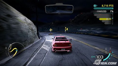
Need for Speed Carbon
Need for Speed Carbon delivers the next generation of adrenaline-filled street racing as players face the ultimate test of driving skill on treacherous canyon roads. What starts in the city is settled in the canyons as Need for Speed Carbon immerses you into the world's most dangerous and adrenaline-filled form of street racing.
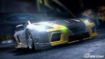
You and your crew must race in an all-out war for the city, risking everything to take over your rivals' neighborhoods one block at a time. As the police turn up the heat, the battle ultimately shifts to Carbon Canyon, where territories and reputations can be lost on every perilous curve. Need for Speed Carbon delivers the next generation of customization giving you the power to design and tweak your crew's cars in every way using the ground-breaking new Autosculpt technology. Represent your car class, your crew, and your turf in Need for Speed Carbon, the next revolution in racing games.
 Detail graphic and storyline. All of the stories using the game engine
 what u see is what u get from the game
 Your sub leader, isn't she pretty?
I rate NFS Carbon 95%, best car racer games. Actually, i do want NFS Carbon has element of car hit & crash like "Burn out revenge". Maybe the developer will add this element at the next version of NFS.
New Project Interior Design

New project of Interior Design for Wedding Planner & SPA service. This new project for 'Nabies' a company that manage wedding planner, ceremony, dais, etc. The pic above is one of 5 plan proposal. The challenger of this project is i need to arrange many rooms in a small work area.
If you have any ideas, please leave a comment please!!!
14 December 2006
Gear of War XBox 360
Gears Of War

In the simplest of words: Oh. My. God. You can open the package and you expect somewhat of a standard FPS, with better than average graphics. But Gears Of War may be the bloodier and better incarnation of both Halo 1 or 2, and HalfLife 2.
Let me say it: Gear Of War is better than Halo.
With graphics powered by the Unreal 3 engine, the amount of spit and polish on this product is immense. The refinement of both the control system, the camera movement, the interaction with the environments, other players, online co-op of the standard single-player campaign, the quality of the AI, and the new puzzles and challenges brought on by your abilities makes this game, the de facto standard of what to expect for “next-generation gaming”.
- First off, the graphics really are as good as that screen capture above.
- The game play is awesome, giving you the ability to run behind objects for cover from the onslaught of enemies. Gaining incremental runs towards a target, while running is impressive, but incorporating this into various missions (pushing bullet-ridden cars along a street in the middle of a firefight to use for cover) and boss fights (running for your life).
- The new user tutorials are part of the mission as in games like Halo, but some parts of the mission are multipath. In other words, you come to a fork in the road and you choose either route. In the opening, this is cleverly handed to you as either go straight to combat, or go straight to training to “workout the kinks”.
- Weapons are fun, with the added gore-magnet of a chainsaw attached to one of your rifles as a bayonet. So should you be equipped with this weapon and decide to use it when a foolish alien comes in for close-quarters combat. You fire it up, saw them in half, and enjoy the blood that splatters and drips on the lens of the camera.
- Yes, there are vehicles, much like in Halo.
There’s more but I could illustrate more by pointing to this stunning trailer for the game. It is all done in-game with no pre-rendered 3D graphics and the haunting music is an unusual but glorious piece to overdub the movie to. The whole thing shows as poetry-in-motion and that’s exactly what Gears Of War is!
UPDATE:
So I’ve finished the game and am still addicted to the running camera movements and the online coop play. The game is shorter than I anticipated, but still a quality buy. In addition *SIGH* it falls a little short in storytelling with a full-bodied storyline (a negative since I have compared it to Halo 1). I’m replaying it on the “Insane” difficulty level which is only do-able if you tackle the game with a quality human partner, online or in the same room. I’m not sure if I maintain my original statement of the game being as much of a genre-defining icon as Halo, but it is certainly the new standard of FPS gaming on the next-gen of consoles. Without question, don’t miss out on it. - SWL
This blog taken from: http://www.secretweaponlabs.com
/words/2006/11/08/
you-cant-resist-give-in-to-the-xbox-360/
13 December 2006


02 December 2006
Next-Gen Console: You Decide The Best
 Good color & contrast using ATI graphic card
 PS3 to bright
 Just like a lower graphic card
 In XBox360, you can see the German army face is full with dust & dirt (are you not taking shower for a week?)
In PS3, man!!! are you taking bath 5 minutes ago?? You look fresh...
In Wii, man!!! you look so young?? How old are you??
 Detail environment & blur environment when you focus on the gun aiming
 Just blur environment when you focus on the gun aiming
 No Comment
 You decide it
 In Xobx360, detail gun shading & looks like metal
In PS3, not too detail & not too metal
In Wii, No comment!!!
 In Xobx360, detail gun shading & looks like metal
In PS3, not too detail & not too metal
In Wii, No comment!!!
 In Xbox360, dust & dirt are display cleary at the hand, bomb and screwnut
In PS3, dust & dirt are display not too cleary at the hand, bomb and screwnut
In Wii, no comment
 In PS3 I look a tank!!
In Wii, what that uhhh!!
Subscribe to:
Comments (Atom)
